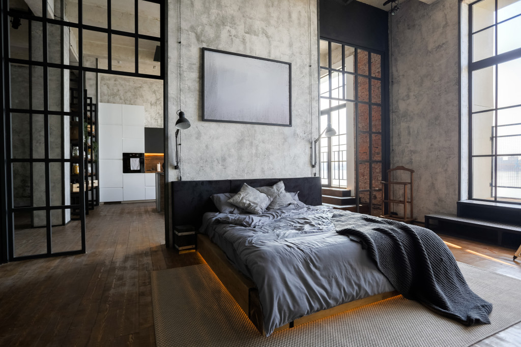
Contrast is a principle you often hear about and apply when it comes to beautifying spaces. In simple terms, it’s placing together or grouping two or more elements that have differing characteristics. When used creatively, it guarantees an aesthetically appealing space that makes a nice, if not remarkable, impression.
The biggest dilemma many homeowners encounter when it comes to contrast is this: how to combine elements without making a visual mess? How do you make sure that differing details can work together harmoniously? Here are some tried-and-tested design moves in making contrast a nice addition to your space:
On Color: Use the Wheel
When applying contrast in your color palette, your best friend should be the color wheel. The safest option is the complementary scheme: two hues on the opposite ends of the wheel. The combos blue-orange, red-green, purple-yellow are the most popular.
When applying these colors, take note that one should be more dominant than the other. If you pick blue as your primary hue, let orange be the accent in the space. The former would cover the walls or ceiling, while the latter would be on textiles and furniture. With this controlled balance, you can make sure that your contrasting colors will render a highly aesthetic look.
If you’re not comfortable with too-bright hues in the wheel, go for light and dark neutrals. The classic option for this is, of course, black and white.
On Shapes: Consider Angles and Curves

The general principle is to mix those that have sharp angles with those that come with soft curves. Your rectangular bed frame, for instance, will match well with an oval mirror above it. The large bay window in the living room can have a better, cozier look if it’s complemented with round throw pillows. But if you’re planning to re-do that entire space, go for a complete window replacement—Utah specialists or window treatment professionals in your locale can help you with choosing an unconventional shape for the fixture.
Of course, it goes without saying that you need to consider the style of your home in mixing shapes. Modernist design mostly features rectangular forms, while eclectic design would provide some room for odd shapes. Your contrast choices should be aligned to the over-all theme of the space, still.
On Texture: Take Note of Visual Weight
Texture is an important component of interior design, as it dictates the over-all feel of the room. If you’re not familiar with the concept yet, texture refers to the tactile quality of an element in a room. In the context of contrast, you want to have a combination of rough and smooth textures. For instance, in the living room, you can pair a marble coffee table with a linen rug. In the dining room, a hardwood table works perfectly with a faux fur table runner.
Beyond hard and smooth, mix natural materials, such as wood and stone with man-made textures, like metals. Combine plain fabrics with patterned ones as well.
Don’t make the mistake of leaving contrast as an afterthought in your interior design. Prioritize it as you pick colors, shapes, and textures. Try to have a balance in everything, and for sure, you’ll be able to pull off your make-over project.

